
While this won't be a discussion about White Dwarf's content or quality or publishing schedule, something that has been bugging me is the current logo. The unexciting, usually orange logo that evokes no sense of...well, anything.
It's just a logo.
A font that evokes no sense of fantasy or sci-fi. It does not have a sense of power or purpose.
Or epicness.
That last one is important, as this was a company that literally created a logo for a game called EPIC 40,000.
 |
| Epic! |
A good logo should convey some sense of what the meaning of the words implies in the context of the product it is supporting. In this example we have a bold block-capital font with a strong industrial and futuristic vibe. It's colored in such a way to suggest that the words are made of metal. It's also wrapped in a black star field, which again suggests a futuristic and/or space setting, and it's framed in the metallic wings which has been a staple in the Warhammer 40,000 logo design gestalt since the inception of Warhammer 40,000: Rogue Trader back in 1987. This logo represents and communicates what it's about and does it so strongly. The first Epic game was Adeptus Titanicus in 1989, and you can see it in the image below:
 |
| Have you ever seen a more epic logo? |
White Dwarf, often during it's lifetime, was sold on news stands as a real magazine. It needed a logo that could compete, stand out, and appeal to the people it needed to appeal to (mostly teenagers and young adults) while standing out from the various other magazines in the shop that could otherwise entice the target reader. After all, this could be someone's first exposure to the wold of Games Workshop, and a good, immediate impression must be made.
 |
| This cover kicked the crap out of the other magazines on the shelf during the month it was on sale. |
 |
| Gold logo for Draco the Inquisitor. |
 |
| Even during the 'Fat Dwarf' era with the red sidebar. |
 |
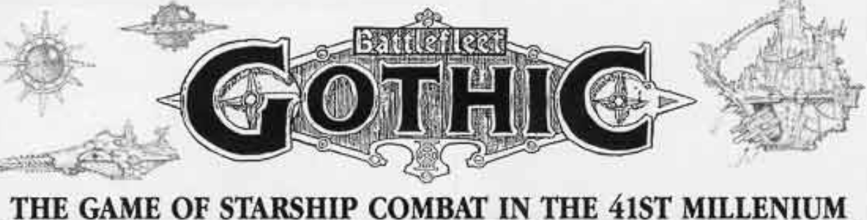
| Gothic coming at YOU! |
By this point the logo was rarely competing with other magazines. Dungeon and Dragon are sadly gone as print magazines and White Dwarf, now weekly, only sells primarily in game shops. But still, that damned logo persists. And it does so for unimaginative reasons: "it doesn't need to compete". Admitted, I liked it at first, It reminded me of the funky font that appeared on old Frank Herbert books, but there are have been times were it detracted from the cover. This isn't the first time that the magazine had a solid color logo, back in the '80s the White Dwarf often had solid colors in the logo, but outlined with a contrasting color to help the logo pop up against the central image. This often worked, and worked well.
 |
| Orange, but used right. Also note specific game logos! |
 |
| Original prototype logo. Works like a charm! |
 |
| Evil, forbidden, mysterious, dangerous, and all so enticing. |
 |
| 'COMBAT' actually used weapons for some of it's letters! |
 |
| Sporty, fantastic, epic and brutal. |
 |
| A logo using two different fonts, yet married together in a perfect story. |
So GW, don't disappoint me this time! Fix the White Dwarf logo! And fix it right!
++++++++++++++
Got a favorite GW logo? Let us know in the comments.
++++++++++++++
All images in this post are (C) or (TM)s of Games Workshop and are used here for review purposes only and are not intended to be a challenge of the marks.
3 comments:
Considering that their most recent core game system is based on a mere 2-page ruleset...I think you're asking an awful lot of their logo designers.
You say that, but have you seen the glut of supplental books that game now has? Also, to my earlier point, they spent more time on the AoS logo than they did on that rulesheet!
I haven't, no. I make no attempt to follow any news pertaining that travesty of a game. I only know they've added points to it as that bit has been posted everywhere....
Post a Comment